

Hi there,
I break down what works on LinkedIn, so you can grow your business.
In this issue, you’ll find:
The one change that revived the lead magnet post (the CTA moved out of the text)
3 real November examples broken down, plus the 5-step formula to build your own
TOGETHER WITH POSTHERO
Grow your audience faster on LinkedIn. With an AI-powered tool that helps you create content and grow on LinkedIn.

Create high-converting content that helps you grow on LinkedIn
Create a weekly content in 76 seconds
AI Voice assistant for creating content in seconds
The Lead Magnet Posts Going Viral Right Now (3 Real Examples From November)
A few weeks ago I told you the “comment X to get it” post was dying.
LinkedIn seemed to be catching the pattern. Posts that said “comment WORD and I’ll send it” in the text started getting way less reach.
So did lead magnet posts die?
Nope.
They just changed shape.
The smart creators didn’t quit lead magnets. They moved the call to action somewhere else. And right now, in November, those posts are pulling in 1,500+ comments each.
Today I’ll show you what changed, break down 3 real examples from this month, and give you a checklist to build your own.
Let’s go.
What Changed: The CTA Moved Into the Image
Here’s the new format in one sentence:
The text has no call to action. The image does.
The post reads like a normal value post. A hook, a story, a breakdown, some insight. Nothing in the text says “comment this word.”
Then the image or GIF does the asking. At the bottom, there’s a big, bold banner that looks like a button:
“Comment ECOM to get it.”
“Drop BO.”
“Comment BRAIN and I will send it over.”
The text stays clean. The CTA is still the first thing your eye lands on.
Best of both worlds. The post looks like normal content, and people still know exactly what to do.
Example 1: 20 Claude Skills for E-commerce
By Marek Dąbrowski
Results: 410 reactions, 1,912 comments
Link: https://www.linkedin.com/feed/update/urn:li:activity:7525890225487806464/
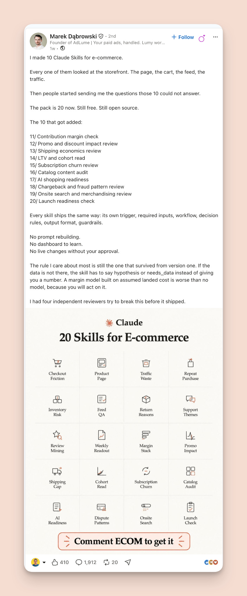
The hook: “I made 10 Claude Skills for e-commerce.”
Simple, specific, and it pairs a hot tool (Claude) with a clear audience (e-commerce).
What makes the body work:
It’s a version 2. People asked for more, so the pack grew from 10 to 20. That’s built-in social proof, and a fresh reason to post about the same asset again.
The specifics let readers self-select. Listing the actual skills means people spot the one they need and think “I want that.”
It kills the “AI junk” objection. Free, open source, won’t invent numbers when data is missing, stress-tested before release. Every line builds trust in the asset.
The visual: The grid shows all 20 items at once. The freebie stops being an idea and starts looking like a product.
The CTA: An orange button-style banner: “Comment ECOM to get it.”
Why it works: 2 things. First, the grid makes the asset feel real. You see all 20 items at once. Second, the “it’s 20 now” angle is smart. He didn’t build a new lead magnet from scratch. He upgraded an existing one based on what his audience asked for. Relaunching an improved version is a move anyone can steal.
Example 2: How to Write Killer DMs
By Mansi Jain
Results: 544 reactions, 1,492 comments
Link: https://www.linkedin.com/feed/update/urn:li:activity:7526539881460871169/
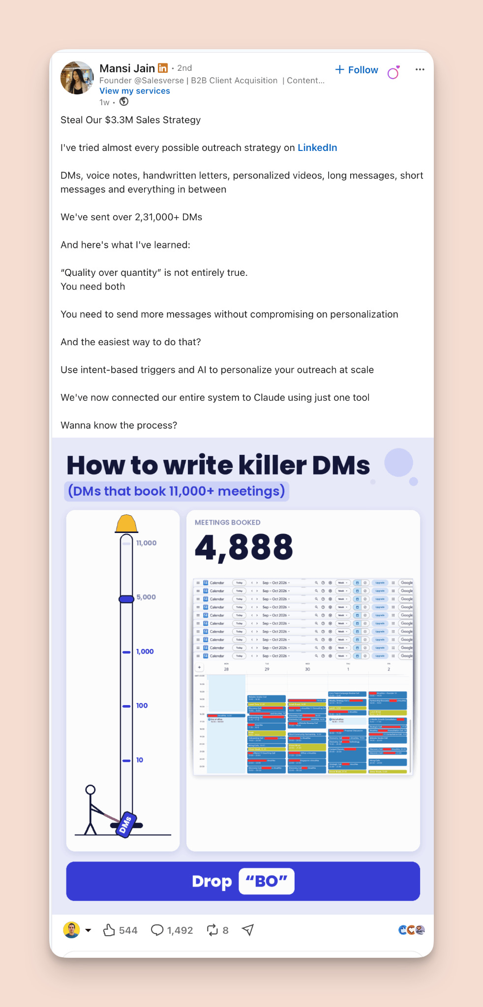
The hook: “Steal Our $3.3M Sales Strategy”
A big number plus the word “steal.” Instant curiosity.
What makes the body work:
Credibility comes before advice. 231,000+ DMs sent. You trust the lesson because of the volume behind it.
It flips a cliché. “Quality over quantity” is something everyone nods along to. Saying it’s not entirely true creates instant tension.
It ends on an open loop. The last line is a question, not a CTA. The image answers it, so the post naturally hands off to the visual.
The visual: It’s animated, with a counter climbing toward 11,000 meetings. Motion stops the scroll, and the visual sells the result before you finish reading.
The CTA: A big blue button: “Drop BO.”
Why it works: The body earns trust with real volume (231,000 DMs) and a contrarian take. The visual sells the result before you finish reading, and the motion stops the scroll in a feed full of static images.
Example 3: The GTM Brain Template
By Raphael Guilhem
Results: 414 reactions, 1,544 comments
Link: https://www.linkedin.com/feed/update/urn:li:activity:7525855377566056449/
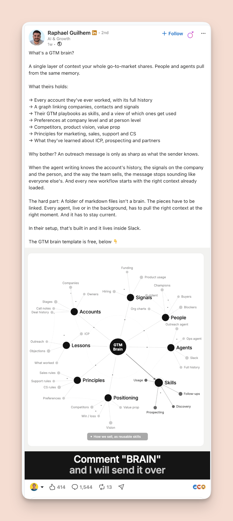
The hook: “What’s a GTM brain?”
A question that names a new concept. If you’re in sales or marketing and haven’t heard the term, you want to know.
What makes the body work:
The abstract becomes concrete. A short list of what the “brain” actually holds turns a buzzword into something you can picture.
It ties the idea to an outcome. Better context means sharper outreach. Now it’s not a concept, it’s a reason.
It names the hard part. Admitting that building this is difficult makes the free template feel like the obvious shortcut. The problem sells the freebie.
The visual: An animated system map. It makes something complex look organized and valuable, exactly the kind of thing you’d rather copy than build.
The CTA: A black bar across the bottom: “Comment BRAIN and I will send it over.”
Why it works: He teaches a new concept, makes it concrete with a list, then admits what’s hard about it. By the end you understand the idea and you’d rather grab the template than build it yourself. The animated map makes a complex system look organized and valuable.
The Pattern Across All 3
Put them side by side and the formula is obvious.
1. The text never mentions the CTA.
No “comment X” in the copy. The visual does the asking.
2. The body teaches something real.
A version 2 story with a clear principle. A contrarian lesson backed by 231,000 DMs. A new concept with a concrete breakdown. Each post is worth reading even if you never comment.
3. The visual previews the asset.
A grid, a meter with proof, a system map. You see what you’re getting before you ask for it.
4. Motion helps.
Two of the three use animated GIFs. In a feed full of static images, movement stops the thumb.
5. The topic is hot.
All three sit in the AI and Claude space, which is where attention is right now.
6. The CTA is one word.
ECOM. BO. BRAIN. Zero effort to type.
And one more thing worth noticing: all three got roughly 3-4x more comments than reactions. That’s what a good lead magnet does. People don’t just like it. They act.
How to Build Your Own
Here’s the checklist.
Step 1: Pick a specific asset your ideal client wants.
Not “my marketing tips.” Something concrete. A template, a checklist, a set of prompts, a swipe file, a system. The more specific, the better.
Step 2: Write the post as pure value.
Strong hook. Teach something real: a lesson, a concept, a breakdown, the story of how you built it. No CTA in the text at all.
Step 3: Design a visual that shows the asset.
A grid of what’s inside. A diagram of the system. A proof element with real numbers. If you can, add motion. Make the reader see the value instantly.
Step 4: Put a one-word CTA inside the image.
Big, bold, at the bottom. Make it look like a button. One word.
Step 5: Deliver fast.
When people comment, send it in DMs quickly. Every DM is a conversation with someone who just raised their hand. That’s the real prize, not the comment count.
Bonus: Upgrade an old lead magnet instead of starting from zero.
Already have a freebie? Collect the questions people ask about it, add what’s missing, and relaunch it as version 2. “It’s 20 now” is a story in itself.
And if you want to automate the whole thing, check out Lead Magnet Pilot. It’s the lead magnet automation I built inside PostHero. It handles the delivery and the replies for you, so nobody waits and you never miss a comment. Full disclosure, it’s my own tool, but speed matters here: the faster people get what they asked for, the warmer the conversation.
One Honest Caveat
This format works right now. I don’t know how long it’ll last.
LinkedIn can probably read text inside images if it wants to. If enough people use this format, it might get throttled the same way the old one did.
So don’t treat the format as the secret. It’s just the current wrapper.
The part that lasts is the same as always: a genuinely useful asset, a post that teaches something on its own, and a visual that makes people want it. Get those right, and you’ll adapt to whatever the next version looks like.
Your Homework
This week, do this:
Open all 3 example posts. Study the hook, the body, and the visual of each.
Pick one specific asset you could give away to your ideal client. Or pick an old freebie to upgrade.
Write the post as pure value. No CTA in the text.
Make a visual that previews the asset, with a one-word CTA banner at the bottom.
Publish it and DM everyone who comments. Track how many conversations turn into something real.
Lead magnets aren’t dead.
They just moved into the image.
That’s it for this week.
If you try this format, reply and send me your post. I’d love to see what you give away.
See you next time.